
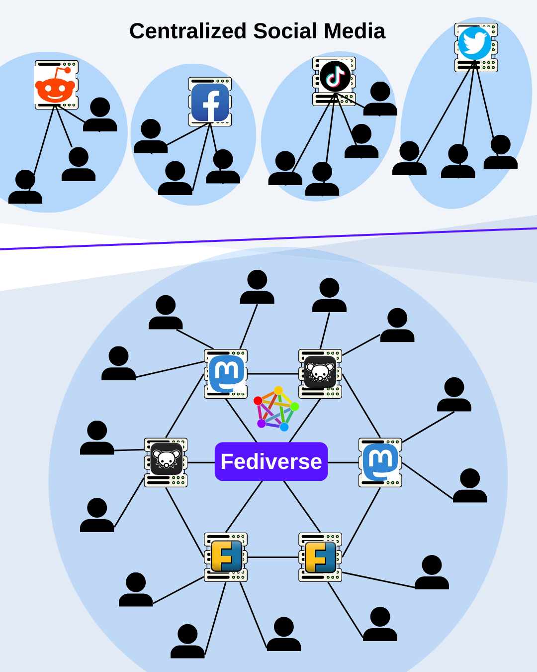
What do you think about this graphic?
It should give an easy overview of the architecture of the Fediverse and what it differentiates from old social media.
What do you think about this graphic?
It should give an easy overview of the architecture of the Fediverse and what it differentiates from old social media.
My criticism is that it largely ignores the primary advantage of Fediverse services (Decentralizing services that are designed to operate Centrally), while mostly explaining what I’ve always considered to be the most pointless feature (Cross Service posting).
It’s a mildly neat feature if you want to centralize your entire social profile under one account (which is my security nightmare but you do you), but its not really fundamental to using federated services and its implementation can be inconsistent and confusing.
Maybe have a bunch of “Lemmy” (or whatever) nodes arranged in a circle, the same color, with the same icon, and connected to each other through the middle of the circle (not connecting to the “fediverse”, although I guess you could have a transparent “Lemmy” super imposed over it) Then have the users connected to each node. Or something…I’m on a bench and just broadly visualizing it.
The next trick is explaining the fault of centralized services in a graph.